Take Five: Reverse Shot in Space
We talk a lot about how the camera moves through space, and the implications of those choices to move in or out or sideways, but it's rare that we just stop to consider the size and shape of the frame itself. And isn't this where every film starts?
The film is a comedy of camera mismanagement in which every 1.85:1 aspect ratio framing is ever so precisely wrong—or fails, rather, to be in the “right” place. Watching it, one is acutely aware of the thin line that separates classical screen grammar from gobbledygook . . .
Rather than pursue an argument against the ascendancy of widescreen TV, or against television’s 21st-century golden age, I’d instead like to direct your attention to a time when ambitious television shows didn’t have recourse to the widescreen mode, distinguishing themselves within the 4:3 standard.
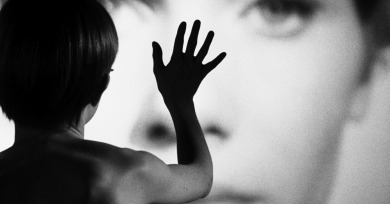
Bergman establishes words as a wholly cinematic element in their own right: an element that physically fills space in the film, that constitutes one of the indissoluble foundations of the film.
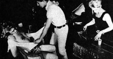
We know objectively that anyone could leave at any time, and yet they remain within these increasingly claustrophobic confines, watching and waiting for the next drip of candle wax or hit of amyl nitrate to launch them further down the rabbit hole. Then again, so do we.
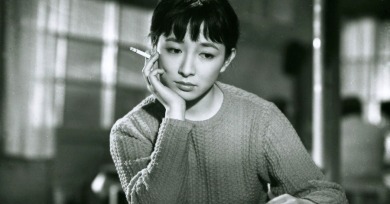
Perhaps no other director is so strongly identified with space—or, more precisely, with a single point in space, hovering statically at about waist height, often in a tidy room in a comfortable, middle-class home located some forty minutes by train from downtown Tokyo.
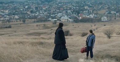
For Mungiu, there are political and dramatic implications to the way that people and bodies occupy and interact within a frame, the way that the camera moves to depict action and reveal setting, and the way onscreen and off-screen space are established.
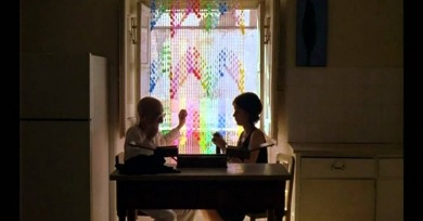
The quasi-autobiographical nature of Monteiro’s late work comes to a conscious conclusion with Come and Go, which unfolds like a retrospective of its lead character’s—and, by extension, its director’s—various conquests and convictions, before summoning death and ending in a kind of aural benediction.
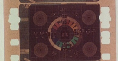
Standard Gauge, at 35 minutes, was made using a 1000-foot reel of 16mm film (the running time purposefully matches the film’s subject; Fisher has often called himself a “literalist”). This extensive length occasioned, for Fisher, a complex orchestration of time and footage.
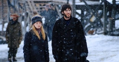
So, with this piece, I want to look at what, exactly, we saw, and what I think that means. I’ll do that by revisiting a film whose pan-and-scan presentation struck me, at the time I rented it, in the dying days of VHS, as a pinnacle of the pan-and-scan format: Michael Winterbottom’s 2000 drama The Claim.
The length of time all viewers of Wavelength are given to ponder the space, those three walls, a ceiling and a floor, invites us to imprint our own imaginary histories on it.
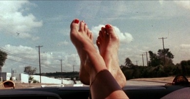
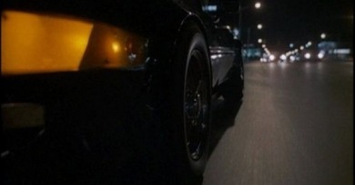
With the woman’s dainty toes center screen, the foregrounded width of the image, and the lovingly worn texture of the film itself, Death Proof is from its very first shot the ultimate Tarantino fetish film.
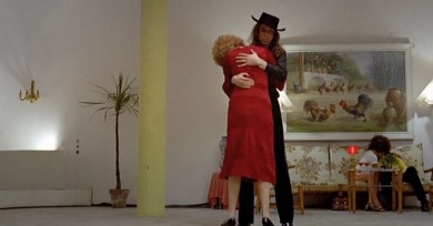
Beware of a Holy Whore was shot in the boxy 1.33:1 aspect ratio standard, at the time, to the 4:3 frame of most TV displays, and it’s striking to see how many bodies Fassbinder manages to squeeze shot-by-shot into the somewhat awkward dimensions of the frame.
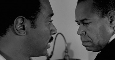
Roemer and Young populate Nothing But a Man’s frame with one finely wrought close-up after another, in which characters—whether it’s Josie’s unctuous father, quietly ashamed to be branded an Uncle Tom by Duff; or Duff’s own pickled, near-vagrant father, experiencing a slow death of the soul—cannot hide their feelings.
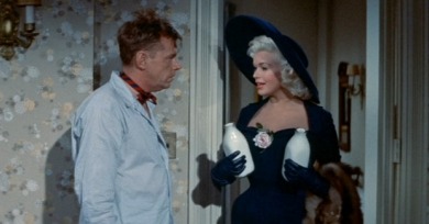
The constraint of 1.37:1 employed in the opening minutes of Tashlin's The Girl Can't Help It is a subtle ruse: Tashlin foregrounds the prevailing aspect ratio of the era for wry self-reflexivity.
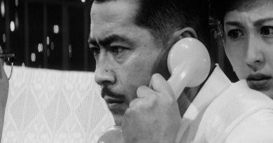
High and Low was shot using the TohoScope process, drastically widening the frame for an aspect ratio of 2.35:1. However much the social and moral themes of the film are posed along the vertical axis—in Japanese, the title is Tengoku to jigoku, “Heaven and Hell”—the images and compositions are constrained to the horizontal.
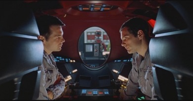
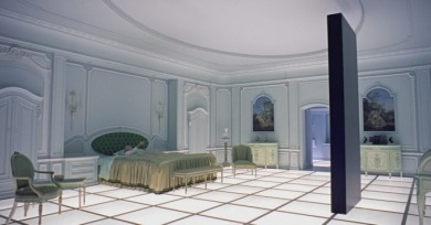
Science, art, and the spiritual have been linked for centuries across pictorial traditions, but they achieve a unique synthesis in 2001: A Space Odyssey, an audaciously cerebral epic that, whenever seen or contemplated in its original 70mm format, never feels like anything less than a miracle of human imagination.
Since the committing of atrocities is rarely recorded and documentaries seldom show those that are—no one in his or her right mind would want to see them—it follows that fictional cinema’s representation of genocidal acts carries the ultimate burden of representation.
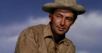
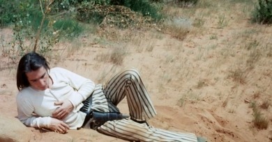
It’s merely a matter of circumstance that Shane was the first movie to get stretched out against its will, but it gives the film a double place in both film history and more specifically the history of the Western, as a movie widely regarded to be a thoroughbred of its genre was also a kind of guinea pig.
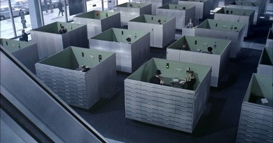
When asked why he chose to make Playtime in 70mm—the first and only time he used the costly format—Tati responded that it was necessary to capture the scale of modern buildings, since he intended the décor to be the star of the film.
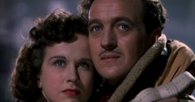
The 4:3 aspect ratio is often referred to as the shape of a conventional television screen, but when contemplating the work of Powell and Pressburger, there is a far more rewarding comparison to be made, which is with the shape of a traditional 19th-century Victorian theater stage.
-390x204.jpg)
