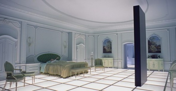
“That movie has a great sense of space.”
It’s a phrase you’ve surely heard before. It’s also one of those phrases that seem to mean less the more you say it or the more you think about it. As Manny Farber helpfully and brilliantly pointed out, the “space” of a film is what one makes of it—the filmmaker and the viewer, and it’s as much an ungraspable, emotional distinction as it is a technical one. It has to do with the way a director uses the frame. It has to do with the way an actor traverses the world of the film she or he inhabits. It has to do with a color field. Or depth. Or shallowness. Space can stretch on for eternity, or it can be swallowed up. Space is self-aware or unwittingly achieved. And as it is completely tied in to a film’s pace, it is also related to time. Perhaps most difficult: there’s no objective criteria. One person’s “great sense of space” is another’s dead zone.
So what are we talking about when we talk about space in a purely visual sense? In an odd quirk of cinephilia, we are especially fetishizing of a film’s frame, and as such we obsess over how the director “fills out” the mise-en-scène. It’s perhaps why Wes Anderson is among the most widely popular of contemporary film artists: He really gives good frame, cramming it with as many colors, tchotchkes, eye-catching costumes, and eccentric folks that a 2.35:1 or wider width can handle. Other contemporary filmmakers, like Lisandro Alonso or Pedro Costa or Bruno Dumont, also tend to be discussed in terms of space, but for a different reason: there’s so much emptiness in their frames, situating characters against or within stark landscapes that seem to bear down on them rather than give them latitude for movement. We talk a lot about how the camera moves through space, and the implications of those choices to move in or out or sideways, but it's rare that we just stop to consider the size and shape of the frame itself. And isn't this where every film starts?
How can we begin to consider filmic space in a more precise way? We’ve framed the argument for our writers. Literally. We asked our contributors to choose one film from any era and talk about how it uses the height and/or width of the frame in its specific aspect ratio. What exactly is a given filmmaker doing within that classically boxy 1.37:1 “Academy” ratio? Or how did that director or cinematographer use up all that length in that super-wide 2.35:1 ’scope frame? Or what is going on in those 1.66:1 or 1.85:1 frames, regardless of whether they were considered industry-standard at any given time? Are there emotional and psychological implications for how we experience films contained within the arithmetic of ratios? Do different ratios tend to produce certain kinds of effects, certain kinds of films? The assignment was wide open: the writers could talk about the way an actor fills a space, physically or metaphorically; or about the way a director composes a shot, or an entire scene; or they could even discuss the way sound and image work together within a frame to create a sense of space; or they could talk about matters of projection and presentation—some films have been screened in aspect ratios they were not shot in. We left it up to them, the only stricture being the focus on one film. This symposium, then, is a continuation of our larger ongoing “Takes” project at Reverse Shot, in which we ask writers to isolate specific film elements to get at a greater whole. Takes one through four looked at a shot, a cut, a sound, and a color, respectively. We felt the shape of the frame made for a perfect number five.
One might assume matters of framing to be ultimately negligible. But nothing in a film ever really is. And with the following essays, our writers once again prove this.
Note: a series at Museum of the Moving Image, See It Big! High and Wide, was specially programmed in conjunction with this symposium. It ran March 6–13.
