Local Color
Justin Stewart on Becky Sharp
“Sooner or later, the majority of important pictures will undoubtedly be made in color. Up to now, the moving picture industry has been like an artist who was allowed only to use pencil or charcoal; now Technicolor has given us paints.”
This was director Rouben Mamoulian speaking with William Stull, A.S.C., in the March 1935 issue of American Cinematographer—a few months before the premiere of the Mamoulian-helmed Becky Sharp, the first full-length non-animated feature film made using the Technicolor Motion Picture Corporation’s “Process 4,” or “three-strip” process throughout. That mouthful of qualifiers is necessary because of all of the previous, competing color-film “firsts,” going back at the earliest to 1895 with Thomas Edison's manual-painted Annabelle Serpentine Dance, produced for peepers into his Kinetoscope, and proceeding through Edward Turner’s three-color additive system patented in 1899, the stencil-color process Pathéchrome, the additive process Kinemacolor, and beyond.
Even limiting the history to just three-strip Technicolor product, Becky Sharp was scooped by Disney, with whom Technicolor inked a three-year exclusivity deal that Walt obligingly let Technicolor reduce to one year after the process proved so impressive and bankable. The delightful Silly Symphony cartoon Flowers and Trees (1932) was the first, and then features like The Cat and the Fiddle (1934) used the process in limited segments. RKO’s musical La Cucaracha (1934) was entirely in three-strip, but it was not feature-length (and Warner Brothers’ Service with a Smile actually beat it to release by a month).
Bedecked with asterisks and qualifiers though it may be, Becky Sharp earns its spot in cinema history, and it’s safe to say that its middling comedy-drama, if somehow divorced from the color and style, would be more or less relegated to the dustbin and considered a lesser light in Mamoulian’s filmography. As much as I would like to bravely champion a maligned masterpiece, this is a case in which the received wisdom (that the film is mostly mediocre but for its technical innovations) is almost objectively correct. Yet it remains a fascinating document, and you cannot, in fact, divorce its style from its substance. Sometimes it’s racist alternate-history balderdash (Birth of a Nation) that masters and codifies narrative film’s storytelling possibilities, or a vaudevillian in blackface (The Jazz Singer) that heralds a growth as ground-shaking as the popularization of sound film.
Technicolor Inc. was formed out of the self-named industrial research and development firm founded by MIT alumni Herbert Kalmus, Daniel Comstock, and mechanic W. Burton Wescott (the latter left the firm before it was chartered under the new familiar name). Kalmus was highly shrewd and judiciously risk-amenable on both the scientific and financial sides, and spent most of his life with Technicolor, with which his name is synonymous. The corporation’s early days were whimsically scrappy enough to deserve its own filmic retelling, with its first laboratory being a fully equipped railway car. It was the best they could afford but offered everything they needed, and also served as an apt metaphor for Technicolor’s forward-pushing momentum as it rolled its way from its native Boston to Jacksonville for the shooting of The Gulf Between (1917). This now-lost film was made with their two-color “Process 1” that limitingly required a special dual-aperture projector, and accompanying technicians, to screen. Next came Process 2, or two-strip Technicolor, which, like Process 1, used a beam splitter in the camera to record a red and green strip. The two negatives were then toned in the lab to bring out more natural colors, and the resulting two strips were then “cemented” together to produce one thick negative that did not require a special projectionist. The first feature to utilize Process 2 was The Toll of the Sea (1922) with Anna May Wong, and you have probably seen color segments of black-and-white films that used this process, like The Ten Commandments (1923) and The Phantom of the Opera (1925). The bulkiness of the cemented negative led to copious technical headaches, such as “cupping,” speed changes, and focus flubs. In 1928, Kalmus and co. introduced Process 3, which incorporated dye imbibition to create color prints. The latest iteration reduced the technical hiccups but still produced non-lifelike results that failed to galvanize the public (though surviving films in this process, like 1933’s Mystery of the Wax Museum, have an eerie beauty).
Technicolor finally struck gold when Wescott and Joseph Ball perfected a camera that exposed three strips of black-and-white film with special emulsion simultaneously. Equipped with a beam splitter, reflector and color filter, the new camera caused each strip to record an image in one of the three dominant colors—red, green, and blue. In the lab, each strip was printed onto a gelatin-coated “matrix” film (watching Technicolor is not vegan), and then three dyes were applied separately to this matrix strip for the “imbibition” process (“IB Technicolor”). While the cameras were prohibitively expensive ($30,000 apiece in early-1930s money), the reproduction process was relatively speedy and could meet the eventual high demand. Technicolor owned the entire process, from filming to print production, even requiring a whole team of engineers and designers to be on any Technicolor set. Now, Kalmus could invoice clients coming and going.
An independent studio called Pioneer Pictures, funded by Technicolor investors Jock Whitney and a Vanderbilt, and initially affiliated with RKO, was established to apply the new and improved process to live-action film. It was decided by Technicolor top brassthat a costume drama—full of elegant gowns and handsome military uniforms—would make an apt testing ground and showcase for the first full-length feature made using the process, and an adaptation of Langdon Mitchell’s staging of Thackeray’s Vanity Fair seemed just the thing. The vivacious, lovable Miriam Hopkins was cast as the title character, surrounded by renowned character actors like Nigel Bruce (best known for his Dr. Watson), the imperious Cedric Hardwicke, and Billie Burke (aka Glinda the Good Witch). The first hardship was not technical, but mortal—the initial director, Lowell Sherman (She Done Him Wrong), died from pneumonia 25 days into shooting. The accomplished Armenian-American Mamoulian, who’d worked with Hopkins on his definitive Dr. Jekyll and Mr. Hyde (1931), was quickly snapped up as the replacement. Wincing at Sherman’s footage, Mamoulian, working with stage designer Robert Edmond Jones, who earns the credit “designed in color by…”, and the Technicolor art team, decided to rethink the use of color and to exploit it to dramatic, rather than decorative, effect.
Paring the story down to only the barest outline, the 84-minute film plays like a college kid’s Drunk History retelling of Thackeray’s epochal, serialized 1847 masterpiece. The dense, fast-paced dialogue, as if played at 1.5x speed, crams so much in that one might wish there was less incident. Set mostly in England against the backdrop of the Napoleonic Wars and framed as a puppet show taking place at a fair (a device of the novel translated into film with the use of a parting blue curtain), the film centers squarely on Ms. Sharp (Hopkins), the orphaned daughter of an art teacher and French dancer, ruthlessly intent on social climbing and status acquisition. After the films opens in the boarding/finishing school she attends with best friend Amelia (Frances Dee), we meet Becky, first seen mocking the coughing, snooty schoolmarm (Elspeth Dudgeon), declaring that “the luxury of emotions is for our betters,” before hurling a dictionary at the mistress on her way out the door. The film follows Becky as she hopscotches between various gentlemen, including Amelia’s brother and husband, and schemes her way up (and then precipitously down) polite society, offending propriety at every turn. “There isn’t an ounce of goodness or sweetness about you,” says one of her admirers, and by the end, Becky has not grown or learned any lessons except that her manipulative striving works—the cravenness of Becky, and Hopkins’s performance in the film, boldly risk reader/audience disapproval, while for Dorothy Parker, Thackeray’s character provided a blueprint of bootstrap self-reliance.
Hopkins’s Oscar-nominated performance is full of impish moments, like her fleeing the scene of a sympathy-winning fake-crying session, after which she puts her ear against the door, licking a vibrantly colored candy cane while she savors her success. Peter Bagrov of the George Eastman House (who screened a print of Becky Sharp from the Netherlands Eye Filmmuseum at their 2025 Nitrate Picture Show) called what Hopkins is doing “Technicolor acting” for the way she modulated it to the hyperreal dominant colors of the different scenes and costumes—a performance that might have seemed hysterical or annoying in black-and-white here rhymes and clashes with the riot of pigments.
After completing his first feature, Mamoulian had said that color filmmaking didn’t interest him, that the grayscale spectrum was broad enough, thank you, and he proved his adeptness at black-and-white throughout his career. But when the opportunity was presented, he seized. While the occasional visual garishness causes mild eye strain, there’s pleasure in recognizing how much thought and planning by Mamoulian, Jones, and the Technicolor team (including DP Ray Rennahan) went into the choice of color for every costume, wall, and prop. The palette used throughout often reflects the muted shades of English fine china and porcelain popular during the Napoleonic era. Although the bulkiness of the Technicolor camera limited the dynamism that had marked Mamoulian’s previous work (like the Manhattan location shooting in Applause or the famous concluding dolly-in on Garbo in Queen Christina), his playfulness with color in Becky Sharp exudes the energy of a kid trying out a new toy. At her youngest and most tranquil, Becky is seen in a soft canary-yellow dress with powder-blue bows. As she battles the world and becomes increasingly cutthroat, lurid pinks and purples creep into her color scheme.
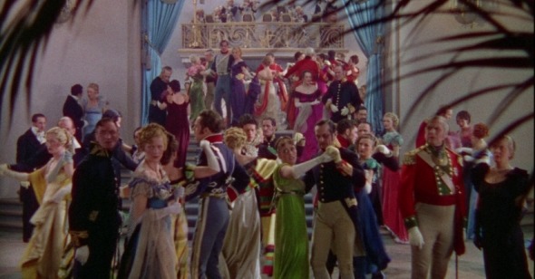
Nowhere does color have more impact than in the grand Brussels ball that takes place in the shadow of Waterloo, and which is eventually interrupted by cannon fire and encroaching military violence—a welcome respite from romantic fripperies and the film’s best scene. Mamoulian color-coded the attendees and orchestrated their hasty exits according to hue, with those in neutral black-and-white leaving first, then officers in blue and dark green, followed by those wearing yellow, light green, and orange—leaving only red, signifying blood, anger, and war. Mamoulian felt that “red is a climax,” which is partially why he disdained Sherman’s original footage, which allegedly splurged on red too soon in the story. A crucial side character in the saga of Technicolor, Kalmus’s ex-wife Natalie was also strongly opposed to any liberal use of red. A mandatory presence as “Color Consultant” on every Technicolor set for a time, Natalie Kalmus had punctilious standards on “color separation” and the meaning of every color that she considered ironclad. She earned the ire of David Selznick, who considered her a nuisance, and Vincente Minnelli, who, on Meet Me in St. Louis, sighed, “I couldn't do anything right in Mrs. Kalmus’s eyes.”
Like Minnelli a highly successful stage director in addition to film, Mamoulian aspired to the Gesamtkunstwerk, which meant meticulous set design, an obsession with rhythmic movement and dialogue synced to movement. After the immersive education of Becky Sharp, Mamoulian used “color scripts” on all his color movies, to match the look of Spanish painters on Blood and Sand (1941) or Grant Wood on Summer Holiday (1948), both in glorious Technicolor. Though he was something of an autocrat on set (former assistant Budd Boetticher complained of the bell Mamoulian would use to summon him), the onscreen results justify the means.
Contemporaneous reviews of Becky Sharp solidified the consensus that has remained: that the drama is so-so but, in the words of Graham Greene, “the colour is everything,” and gives “so much delight to the eye that it would be ungrateful to complain.” An eloquently florid review in the New York Times by Andre Sennwald has it that, though “dramatically tedious,” Becky Sharp “is a gallant and distinguished outpost in an almost uncharted domain” and “an animate procession of cunningly designed canvases,” referencing Keats by writing that “it produces in the spectator all the excitement of standing upon a peak in Darien and glimpsing a strange, beautiful and unexpected new world.”
Technicolor quickly made giant leaps after Becky Sharp. It attracted color-shy major stars Dietrich and Charles Boyer in The Garden of Allah (1936), the box-office success of which enticedother Hollywood royalty. The same year’s The Trail of the Lonesome Pine showed that the process worked well for outdoors shoots. Then, in 1937, maverick William Wellman fired off two superb Technicolor pictures, Nothing Sacred and A Star Is Born. Following Disney’s full-length triumph Snow White and the Seven Dwarfs (1937) and The Adventures of Robin Hood (1938), with its majestic forests, beer halls, and Errol Flynn’s iconic Lincoln greens, Technicolor’s dominance was fully cemented in 1939 with the one-two punch of The Wizard of Oz and Gone With the Wind.
Technicolor’s dominance lasted through the 1940s before ceding ground to other processes like Eastmancolor, Cinecolor, Trucolor, DeLuxe, etc., in the 1950s, before falling out of fashion and convenience in the mid-1960s. Technicolor’s adaptation to format changes like CinemaScope, VistaVision, and gimmicks like Cinerama and 3D also helped the company’s longevity, and regarding shelf life, Technicolor prints have proved far more resilient than fade-prone Eastmancolor prints, for example. The last films to be made in Technicolor included those by connoisseurs like Francis Ford Coppola (The Godfather Part II, 1974) and Dario Argento (Suspiria, 1977).
While the company’s glory days tapered off, it can be stated with confidence that, as talkies did with silent films, color “won” a hypothetical battle with black-and-white. In the modern era, when monotone is employed it’s either for financial reasons (at least in the pre-digital times) or a deliberate artistic choice (The Man Who Wasn’t There, Roma). There are many who feel that cinema as a distinct artform reached, or was reaching, its zenith toward the end of the silent (pre-Technicolor) era, before sync sound’s advent halted its movement away and dragged it to the stage, but the innumerable number of films that have since used sound and color to masterful or even just notable ends is obviously enough to muffle the snorts of cinematic originalists. And so the vaunted stature of Becky Sharp—dramatically middling and artistically disposable though it may be as art—as a cinema history milestone is secure, proof of how even the most unremarkable films can blaze remarkable destinies.